jueves, 8 de diciembre de 2016

YOUR MASTERPIECES OF ART

Click on the picture above to access the Lino.it canvas.


The video bellow will teach you how to use this cooperative and collaborative tool called lino.it

viernes, 18 de noviembre de 2016

COMPLEMENTARY COLOURS

Complementary colours are pairs of colours which, when combined, cancel each other out. This means that when combined, they produce a grey-scale colour like black. When placed next to each other, they create the strongest contrast for those particular two colours.
In the traditional model, a complementary colour pair is made up of a primary colour (magenta, cyan and yellow) and a secondary colour (green, violet or orange). For example, yellow is a primary colour, and painters can make violet by mixing of red and blue; so when yellow and violet paint are mixed, all three primary colours are present. Since paints work by absorbing light, having all three primaries together results in a black or grey color


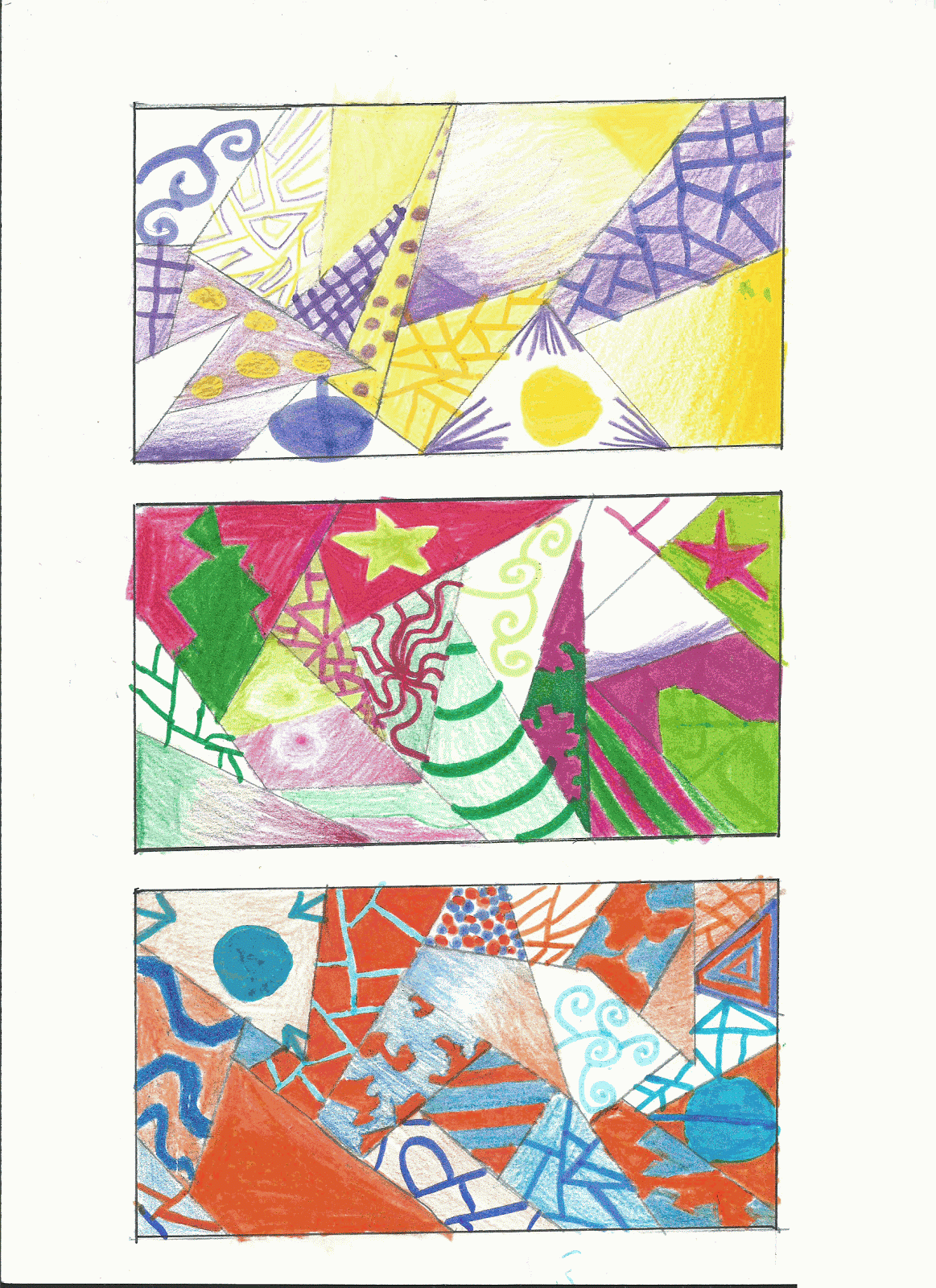
Divide each rectangle into different parts using a ruler or set squares, draw these lines with the 0,2 fine liner, then fill each area using a pair of complementary colours:

PRIMARY.......................................................SECONDARY
CYAN..........................................ORANGE (yellow+magenta)
MAGENTA...........................................GREEN (yellow+cyan)
YELLOW...........................................PURPLE(magenta+cyan)

Try to use different textures, techniques and shades of the same colour. If you want to use felt tip pens as well as colour pencils, you´ll be able to get more vibrant colours.


domingo, 30 de octubre de 2016

STIPPLING (Neo-Impresionism & Pointillism)


Stippling is the creation of a pattern simulating varying degrees of value or shading by using small dots. Such a pattern may occur in nature and these effects are frequently emulated by artists.

Artists like Seurat and Signac took advantage of this phenomenon
and tried to get purer colours by mixing them optically.


Google


Pointillism is a technique of painting in which small, distinct dots of color are applied in patterns to form an image. Georges Seurat and Paul Signac developed the technique in 1886, branching from Impressionism. (Wikipedia)

GEORGE SEURAT (1859-1891)

A Sunday Afternoon on the Island of La Grande Jatte, Georges Seurat

Just in case you want to know more about Georges Seurat here you have a short video.


And here you have a videotutorial on how to work using this technique (spanish subtitles).

We´re going to use this technique to colour these beautiful mandalas.

miércoles, 5 de octubre de 2016

ANAMORPHOSIS AND THE GRID METHOD


Do you know anything about anamorphosis?


An anamorphosis is a deformed image that appears in its true shape when viewed in some "unconventional" way.
We can find many examples on our daily life, the most common use of the anamorphic design is by far in road markings.  
We have to see those marks from our vehicles in such a low point of view that they are going to be percieved distorted and shorter than they actually are.


Julian Beaver is a well known street artist. He has made pavement drawings all over the world for many years.
Anamorphic illusions drawn in a special distortion in order to create an illusion of 3 dimensions when seen from one particular point of view.


Here you have an easy project.