miércoles, 24 de enero de 2018
viernes, 19 de enero de 2018
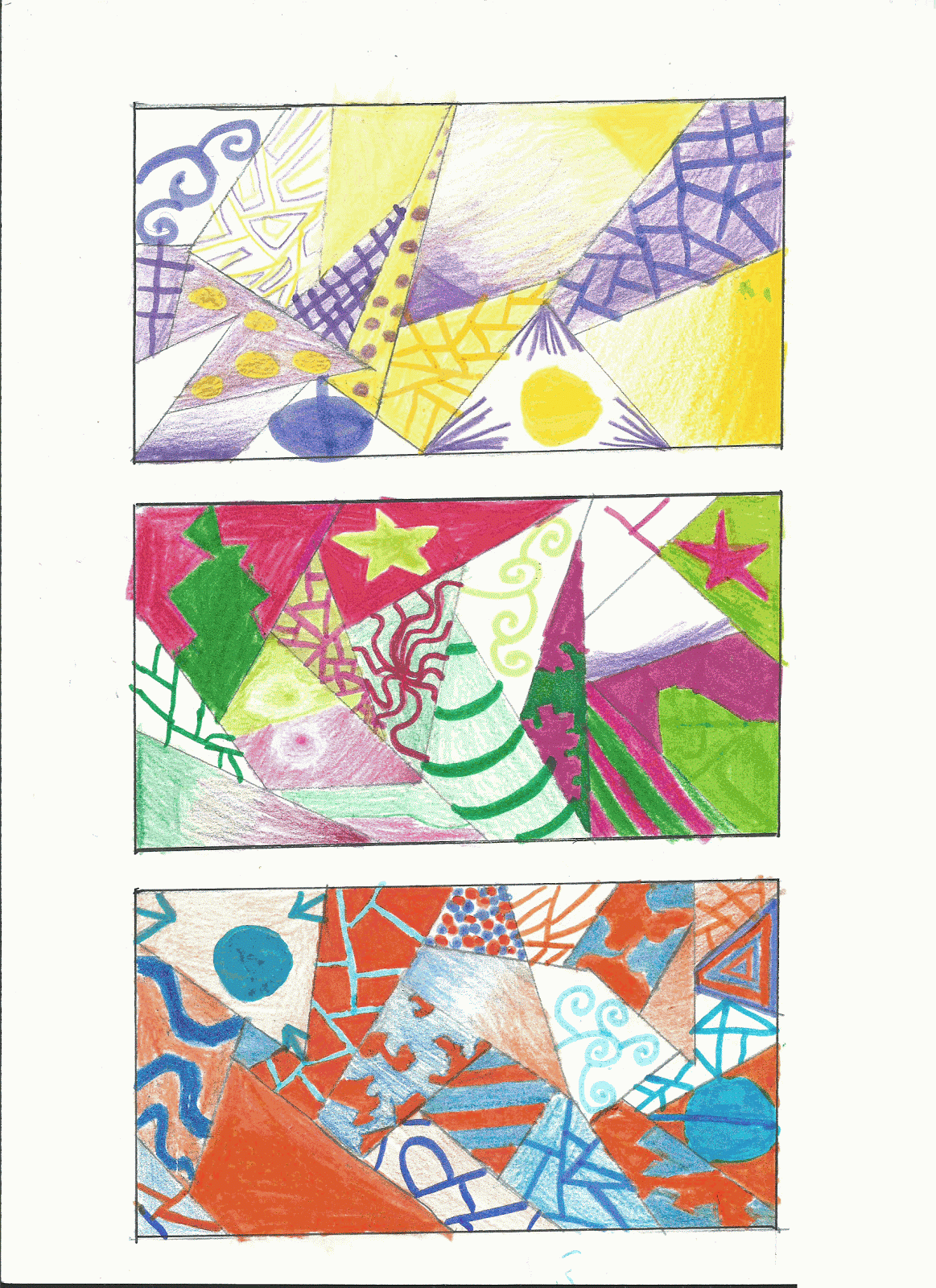
COMPLEMENTARY COLOURS

In the traditional model, a complementary colour pair is made up of a primary colour (magenta, cyan and yellow) and a secondary colour (green, violet or orange). For example, yellow is a primary colour, and painters can make violet by mixing of red and blue; so when yellow and violet paint are mixed, all three primary colours are present. Since paints work by absorbing light, having all three primaries together results in a black or grey color.

PRIMARY.......................................................SECONDARY
CYAN..........................................ORANGE (yellow+magenta)
MAGENTA...........................................GREEN (yellow+cyan)
YELLOW...........................................PURPLE(magenta+cyan)

Try to use different textures, techniques and shades of the same colour. If you want to use felt tip pens as well as colour pencils, you´ll be able to get more vibrant colours.
domingo, 7 de enero de 2018
TEXTURE
DEFINITION OF TEXTURE:
The quality of a surface, often corresponding to its tactile character. or how it feels to touch.Texture may be created explicitly in art, but it can also be implied through the use of line, shading and colour variants.
If you want to download this worksheet click here.
Just in case you want to know the name of each of your fingers here you have an illustration and the reason why they are called this way.
Suscribirse a:
Entradas (Atom)